Configure the Chat Bubble
The HelpGent chat bubble lets visitors open a form from a floating control on selected website pages. You can choose where the bubble appears, select its visual style, and customize its color, size, and welcome text.
Open the chat bubble settings
- Open the form from HelpGent → All Forms.
- Select the Share tab.
- Choose Floating form.
- Under Display type, select Chat bubble.
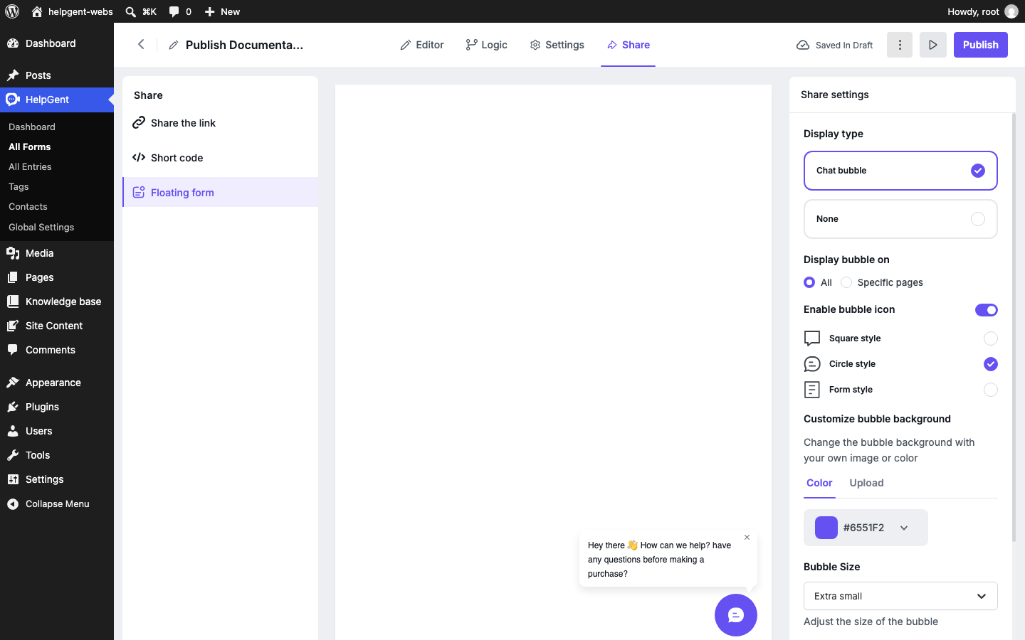
Choose where the bubble appears
- All: Display the bubble on all available pages.
- Specific pages: Choose the WordPress pages where the bubble should appear.
Select Specific pages when the form belongs to one part of your site, such as a support area, pricing page, or product documentation page.
Customize the bubble
| Setting | What it changes |
|---|---|
| Enable bubble icon | Shows or hides the icon inside the floating control. |
| Square style | Uses a square visual style for the bubble icon. |
| Circle style | Uses a circular visual style for the bubble icon. |
| Form style | Uses a form-oriented visual style. |
| Customize bubble background | Choose a color or upload an image for the bubble background. |
| Bubble Size | Sets the size of the floating control, including the Extra small option. |
| Bubble Header Text | Sets the welcome text shown when the bubble is minimized. |
Save and publish the bubble
- Choose the display type, page visibility, style, and text you want.
- Review the preview in the center of the Share screen.
- Wait for the form to show Saved in Draft.
- Select Publish to make the updated bubble available on the selected pages.
Verify the result
- Open one of the selected pages in a private browser window.
- Confirm that the bubble appears in the chosen position.
- Select the bubble and confirm that the HelpGent form opens.
- Check the result on desktop and mobile widths.
To embed the form in page content instead, see Add a Form to a WordPress Page.