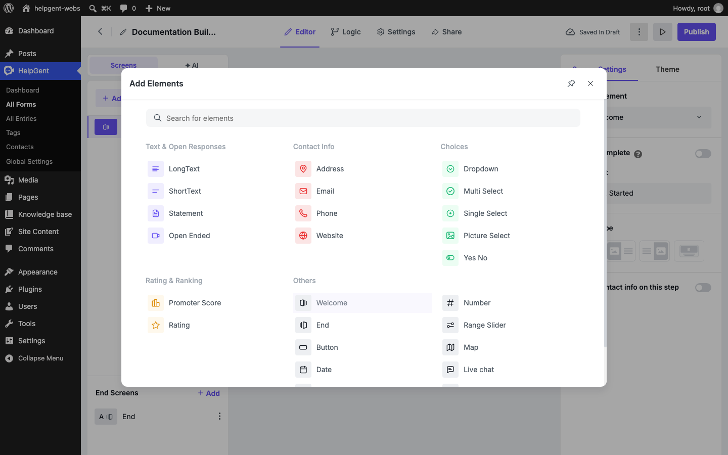
Use this page to choose the right HelpGent element for each step in your form. The element library is grouped by response type, so start with the kind of answer you want to receive and then choose the element that makes that answer easiest for the user.
The Add Element library is the quickest way to find an element by the kind of response it collects.
Text fields and open responses
Element
What it collects
Good for
Short text
A brief written answer.
Names, short project descriptions, order numbers, and one-line answers.
Long text
A longer written response.
Detailed requirements, explanations, and feedback.
Statement
Information shown to the user without collecting an answer.
Instructions, context, disclaimers, or section introductions.
Open Ended
An open response using a supported response mode such as video, voice, text, or screen recording.
Video applications, customer stories, product explanations, and richer support requests.
Media fields
Element
What it collects
Good for
File Upload
A file attached by the user.
Screenshots, documents, examples, or other supporting files.
Open Ended
Video, voice, text, or screen-based responses, depending on the selected response mode and plan.
Screen-recorded issues, video applications, voice feedback, and asynchronous messages.
For media responses, explain what the user should show or say and give a reasonable time or file-size expectation. This usually produces better answers than a broad “Tell us more” prompt.
Selection fields
Element
What it collects
Good for
Dropdown
One choice from a compact list.
Country, service type, budget range, or department.
Single Select
One visible choice from a list.
Qualification questions where users should see all options.
Yes No
A yes-or-no answer.
Eligibility, confirmation, and simple routing decisions.
Multi Select
More than one choice.
Multiple services, tools, interests, or issue categories. This is a Pro element.
Picture Select
A choice represented by images.
Style selection, product choices, visual preferences, or image-based quizzes. This is a Pro element.
Contact information
Element
What it collects
Email
An email address.
Phone
A phone number.
Website
A website address.
Address
Address information.
Ask only for contact details that support the next step. For example, a coach may need an email before booking a call, while a product-feedback form may need no contact field at all.
Chat and conversation
Element
What it does
Good for
Live chat
Lets the user start a live conversation.
Pre-sales questions, support handoff, and conversations that need a human reply.
Ratings and feedback
Element
What it collects
Good for
Rating
A star-style rating.
Satisfaction, quality, or experience scores.
Promoter Score
A recommendation score.
NPS-style feedback and customer loyalty surveys.
Other elements
Element
Use it for
Welcome
Introduce the form and explain what users should expect.
End
Confirm completion and provide the next action.
Button
Add a button-based action or call to action.
Date / Time
Collect a date or time selection.
Number
Collect a numeric answer, such as quantity, budget, or score.
Range Slider
Let users choose a value along a range. This is a Pro element.
Map
Collect or display location information where supported.
GDPR
Collect privacy or consent acknowledgement.
reCaptcha
Add spam protection to the form.
How to choose quickly
Need a sentence? Use Short text.
Need an explanation? Use Long text or Open Ended.
Need a video, voice note, or screen recording? Use Open Ended and choose the appropriate response mode.
Need one known answer? Use Single Select, Dropdown, or Yes No.
Need several answers? Use Multi Select.
Need an opinion score? Use Rating or Promoter Score.
After choosing an element, review its screen-specific settings and test the form as a user. The available settings depend on the selected element and your HelpGent plan.
Still need help?
Can’t find the answer you’re looking for? Our support team replies within one business day.